Case Study
Immersive Customer Experience/ Futuristic Phone Booth
Creating an unforgettable Customer Data Funnel for a Japanese cosmetic company
Overview
At a flagship NYC store in SoHo, a Japanese cosmetic company wanted to inspire customers to share their contact info through a novel, high-impact, immersive amified sign up experience.
The concept was to create highly stylized, futuristic phone booths, with custom touch panel screens and gamification that will funnel the customer toward sharing their email address and phone numbers.
I conducted early usability testing, revealing that users expected a touchscreen interface rather than a dial pad. Based on my insights, I advised C-suite executives and led a design pivot to a touch panel system, ensuring a seamless and intuitive experience. This increased engagement, improved usability, and boosted email sign-ups, successfully integrating technology with customer experience.
Role: Project Coordinator, UX Researcher, UX Designer, Service Designer
Budget: $60 Million
Timeline: 13 months (Delivered successfully in June 2019)
Deliverables: Phone booths with custom touchpanels
Teams: 100+ people
Japanese team (Project Manager, Graphic Designer, 2 Front-End Developers)
American team (7 Back-End developers, LED light technician, Writer, PR team , Audio team, Architect team, Carpenter team)
Problem Statement
How can we both create a memorable, impactful experience for users which also inspires them to share their contact information?
Users & Audiences
There was a broad audience of fashion-conscious people and tourists who would be attracted to explore pop-up store experiences in SoHo NYC.
Challenge
The founder of the company proposed the general idea of creating a futuristic phone booth experience for his customers. Our team needed to refine the concept and bring it to life before the opening day.
As a UX Designer, my main challenges were to:
create a powerful impression of our brand while inspiring the customers to share their contact information
make sure that the Japanese design would make sense to a Western audience.
act as a liaison between the Japanese and American design teams.
The biggest technical challenge we faced was creating a custom touch panel screen. This was further complicated by the fact that our customers came from a wide variety of backgrounds and spoke different languages, therefore, we needed to make the experience customizable.
The completed product. Photograph taken after-hours the day after the opening party.
The design process
The founder of the company had a concept in his mind of a futuristic phone of an interactive customer journey that he would like to implement. The Japenese team before I was involved started creating prototypes of the phone and the design team created illustrations of what the phone booth area could look like.
The Japanese design team had a vague idea of the customer journey, so based on their discussions I created this initial storyboard so that all team members could begin to visualize the experience.
I used images of the initial prototypes and illustrations in the storyboard.
Intial User Flow
After several meetings with the Japanese designers, the ideas began to become more fleshed out. During the ideation process, I would sketch various user flows. When the team settled on an iteration that they were ready to move forward with, I shared this user flow with the American team.
The journey begins with the user entering the phone booth and ends with them sharing their personal information like their name, phone number, and email address.
The PR company wanted to share the customers’ voices on social media, so we created an affordance to record their messages through the phone receiver.
Original User Flow
Usability Test
Original Screen Flow
At this point the product was beginning to take shape but we had not yet conducted any usability testing.
I conducted usability tests with both 10 users and 4 employees. These tests revealed three main issues and we came up with several solutions.
The text on the screens and voice on the other end of the line of the phone was in English, but several users preferred Spanish.
Solution: Add a Spanish language option (text and audio)
The PR team sometimes could not identify the language of the messages recorded by users in the phonebooth so they didn’t know how to properly use them in social media.
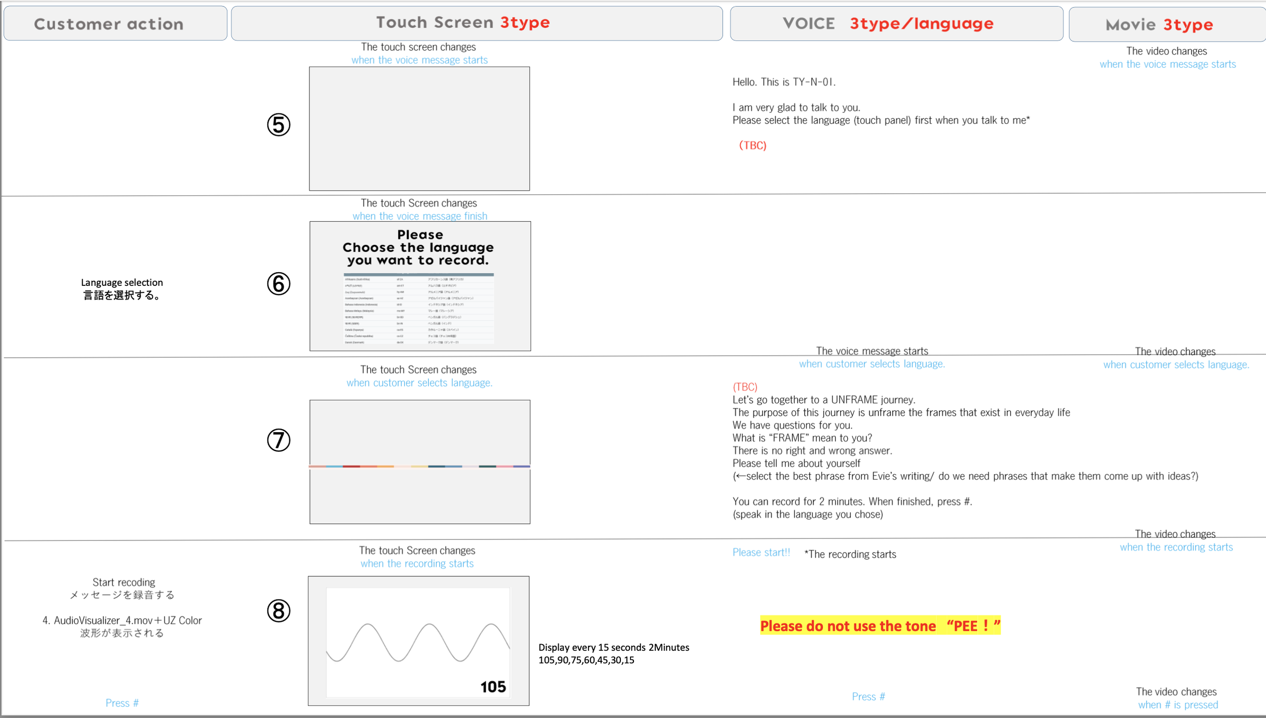
Solution: Add a language selection prompt to the screen before they record. (This was a huge undertaking because what had originally been a normal screen, now needed to become a touch panel screen.)
Entering information using the push button on the phone is not ideal.
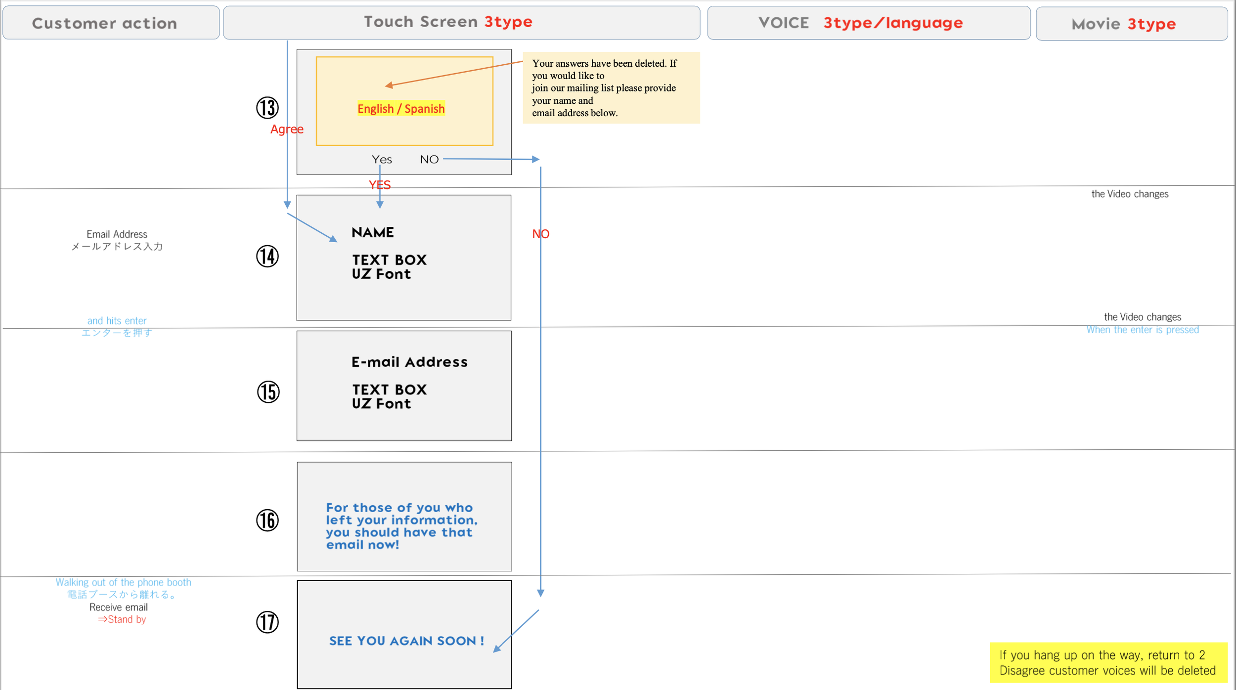
Solution: Create a keyboard on the screen
Touch Panel User Flow
Informed by our usability tests we began the development process in earnest. We quickly realized that we would need to create much more complex user flows, as illustrated below.
Installation Design
The team now began the detailed process of designing the “booths'“ themselves, including touch screen panels, LED panels, and complex, interactive, LED light design. There was also extensive audio design. The audio and video elements would all be triggered when the user stood in a particular place in the phone booth.
Additionally, we needed to hire voice actors to record the audio the users would hear when they picked up the receiver.
The touch panel experience and audio experience were designed to be a novel experience that encouraged customers to share their contact information to connect with the company for the latest promotions.
At the PR company’s request, we also built out the ability for the users to record their responses to questions prompted by the voice actors such as asking the user something like, “What does beauty mean to you?” This could be used later for promotional materials.
Usability Test 2
A second round of user testing was a very useful guide toward the final direction.
Problem: Some users found touch panel was difficult to use and complained it was too small.
Solution: Increase the size of the keyboard.
Problem: Users found some of the color schemes of the text hard to read.
Solution: Increased the text size and made all the text black and white.
Problem: Users found some of the color schemes of the animations made them hard to see.
Solution: Increased the color contrast of the animations
Problem: Users found the animations distracting while they were entering their information.
Solution: Pause all animations during that process.
Opening Day Delivery
Miraculously, despite all the complexity and we successfully created a product that delivered all of these complex goals. Below is a picture of the completed phone booths, the final userflow/script that customers would engage with once they picked up the receiver, and some animations of the phone itself.
Next Steps
Our user testing guided us to include a version of the experience in Spanish. When the store opened we discovered that many of the customers spoke only Chinese. Our next step was to make the experience possible in Chinese which we added 6 weeks after the opening.
We also broadened our focus, reflecting on the fact that that there was a huge amount of street traffic, many of whom were potential customers, passing by the store after hours. It was worthwhile to make an additional custom light design for the way the installation would appear from the street after the store closed. This was intended to create interest to all those who passed by.
As traditional Japanese culture respects the four seasons, the lighting design we was adjusted seasonally to match colors associated with each particular time of the year.
Conclusion
This project was a very challenging endeavor. The challenges included acting as a liaison between the Japanese and Western teams who had very different approaches to design and work culture. There were also many complex technical elements and many moving parts including a staff of over 100 people.
I am proud that despite these challenges our team achieved our goal, and created a truly novel experience. Tens of thousands of customers engaged with these phone booths and, from my observations, seemed delighted. The large majority were pleased enough that they chose to share their contact information and stay in touch with our company.
We created a high-impact, memorable, experience and now many new customers were now connected and ready for the next adventure.


